 This is the first post in a series of three showing COLOR TRENDS for Spring/Summer 2009, as presented by Pantone. There are nine colors in the forcast, and we can't help but notice the influence of the 1970's and 1980's fashion colors. Each slide shows our color group with examples that are close if not exact to the color trend prediction. The purpose is to show vintage examples, both fabric and fashion, that contain the color or are a good compliment to wear with that color.
 The first slide shows a soft lavander that was wildly popular as the 'Halson' years progressed. At the time it was mostly seen in soft Quiana knits, voile tops, and skirts. This tone is great when mixed with denim and upbeat solids that are deeper and stronger in hue. [Lavender: 15-3817]
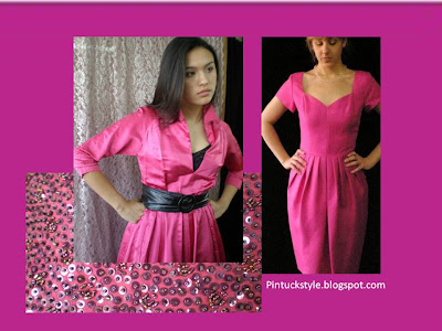
 Bright, deep pink was used extensively in the 1980's. Termed magenta, fuchsia, or hot-pink it saw use in prom, bridal and other formal wear. As a sportswear color, the '84 Olympics went so far as to pair it with a teal blue. Today fuschsia looks vintage. It can be styled successfully as a solid, or used to accent a look. [Fuchsia Red: 18-2328]
 This vivid warm blue is more compelling than other blues we have seen in recent seasons. The color is bright, clear and warm, unlike the violet-toned blues of last winter. This blue presents a cross over from as far back as the 1950's and 1960's, when bright blues were a huge fad in modern design. It re-emerged in the 80's showing up on blouses, in suits and dresses. [Palace Blue: 18-4043]
The items in the slides above are all from the Pintucks collection: past, present and future. If you see something you like, just ask, it may be available.


Tidak ada komentar:
Posting Komentar